As a millennial, it’s often bothered me when we’re accused of having short attention spans. Well, as it turns out, it’s true. But according to this recent Microsoft study, we’re not alone!
Back in 2000, the average human attention span was 12 seconds. By 2013, that number had dropped to a measly 8 seconds. For the sake of reference, a goldfish has a 9 second attention span. If you’re a company with a website, app and/or product, this is big news. It means you have even less time than you thought to get your message across.

I can’t say I’m surprised by these findings. On average I have three devices demanding my attention (and they said this Apple Watch was supposed to help with that). But with all these extra screens, shouldn’t we also have more opportunities to reach our user?
The short answer is yes, but on one condition. We need to figure out how to personalize.
According to Microsoft’s study, “49% of participants were more likely to pay attention to communications when they’re delivered in the right context, at the right time.”
Sounds reasonable.
The problem is that personalization has become this Holy Grail that we’re all seeking out, but we don’t really understand where to find it. Everyone is going about it in different ways, and no one has really done it right.
At the start of thinking about personalization, we of course need to know about our users. Who are they? What motivates them? What inspires them?
Easy enough, let me prepare my list of questions and -

Wait. I forgot, we only have 8 seconds. We better make these questions count.This is INSANE. How can we expect our users to take the time to teach us about themselves when our method of collecting data hasn’t evolved in the last 20 years?
Make no mistake, you and your product/app/software are soldiers in the war for attention. Winning this war is hard, some would say impossible.
If you’re going to enter the fray, there’s a few things to consider.
Visual
There’s a technique writers are taught — “Show, don’t tell”
This basically boils down to don’t bore the audience with exposition when you can give them action, feelings, etc. The same principle applies with your product/app/software and your audience. Would you rather read this paragraph describing why my app is great or watch this video?
It should come as no surprise that the visual social networks (Snapchat, Instagram) are outpacing most of the mainstays (Facebook, Twitter) at every turn. When looking at user interactions across social media networks, Instagram has 58 times more engagement than Facebook and 120 times more engagement than Twitter.
We live in an age where a picture is actually worth a thousand words, and the brands that are winning understand that. If you want to win the right to a user’s attention, consider offering content that can be consumed in seconds. If not, you risk losing that user to the next best thing.
When we started Traitify (at that time known as Woofound) back in 2011, we wanted to create a way to personalize the world around you through understanding personality traits. With this concept, we started mapping out all the factors we wanted to measure and in no time those factors covered the entirety of a whiteboard.
I remember thinking “How in the hell are we going to collect all this data without boring the user to death.”

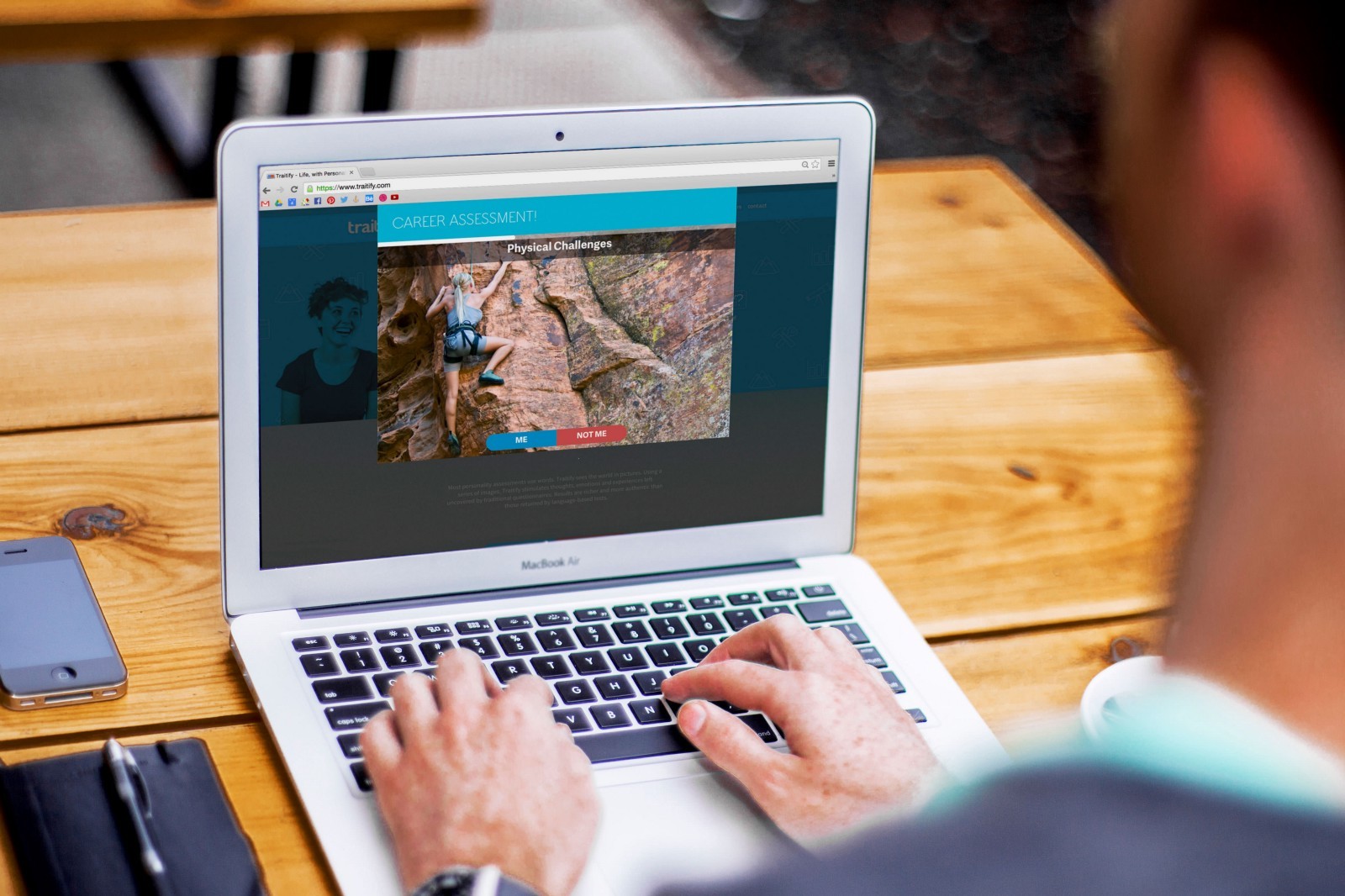
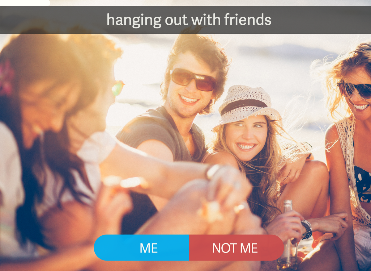
We instinctively knew that as users we would never go through the process of filling out endless check boxes and form fields and that we needed a better way. Because of our backgrounds in visual media/design, it was a natural leap to consider using images as the building blocks for this new method.
With images, we cut the time down from 30+ minutes (typically what you see on traditional assessments) to 2+ minutes. Before anyone cries foul, yes I am aware this is more than 8 seconds. Consider however, that we are transitioning our users (or your users if you use our awesome API!) from point of interest (this only takes milliseconds to process) to point of interest in seconds. All because we were able to transform long boring questions into beautiful images.
If you’re serious about keeping your user engaged, visuals are a fantastic way to convey so much information (or collect so much information) in a very short amount of time.
Speed
Did I mention that our assessments take minutes?
Everyone hates waiting and unfortunately, too many products/apps/software seem content to let users spend their precious time (seconds!) waiting.
This is particularly important when you’re addressing personalization. We live in a culture that expects instant gratification. If you’re collecting data to personalize, make it fast and make the results instant.
A company that has spotlighted personalization is Netflix, and much of what they do is based on your ratings and viewing history. Don’t get me wrong, I love Netflix (I’ve been a proud subscriber since 2006), but going through and rating every movie you’ve seen can be kind of tedious. I want something fast and instant!
We’ve often thought of our assessments as the answer to the “cold start”, how do you make recommendations of a user without heaps of data. Asking them to run through a couple of minutes of images and pick “Me” or “Not Me” seems like a pretty low barrier to entry.
Don’t make your users wait — remember you’re on the clock. Make it count!
Fun & Simple
If it’s not fun. If it’s not engaging. It’s got nothing.
I’ve talked to so many startups that want to throw everything into their apps. I’m talking kitchen sink and all. Confession, I’ve been that guy, I’ve advocated for putting in way more than was necessary.
Our first app, Explore, leveraged the Traitify assessment to help users find things to do wherever they were. Great idea!
Not so great ideas: allowing users to create itineraries, have profiles with pictures, message each other, etc.
Ok. So some of these ideas could have worked, but we should have — and you need to — start simple and build based off what the user wants. It’s so easy to get caught up in making something into a Swiss Army Knife that you forget the best apps are often beautifully simple.
Does simple always equal fun? No, of course not. But I guarantee if you make the experience overly complex it will drain every last ounce of fun.
What’s Next?

Sometimes you have to look at what currently exists, nuke it, and rethink a concept from the ground up. At Traitify, we believe in the power of personality and personality assessments. The problem is, nobody looks forward to taking a 30-minute personality inventory on their iPhone! It left us with no choice but to reinvent the way people take personality assessments.
For us, personalization will continue to evolve, and we’ll get better at understanding users. Part of this process is allowing the user to teach us about them with ease. We’ve learned to focus on making your content and process an engaging experience.
Don’t be afraid to create something that will make your user smile.


 Subscribe to Our Blog
